
You know that feeling when you save the tenth picture of a perfect kitchen to your Pinterest board, but still have no clue how to make it work in your own home? We’ve all been there. After filtering through hundreds of designs from top showrooms and real homes, we’ve narrowed it down to the layouts that actually deliver on both style and function for 2026. This isn’t just another photo dump. We’re diving deep into 28 distinct kitchen layout ideas, breaking down everything from chic galley kitchens and spacious double-island setups to cozy U-shaped nooks. As we continue to use our kitchens for everything from a home office to a family hub, getting the layout right has never been more critical. And stay until the end — we break down the most common mistakes that can ruin these looks. 📌 Save this to Pinterest for later — you’ll want to revisit these ideas.
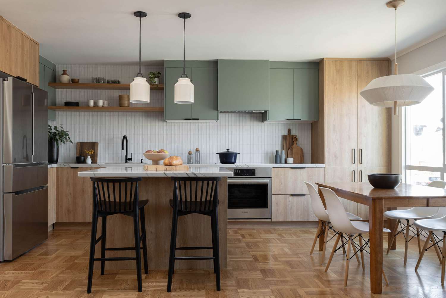
1. Sage Green and Light Wood Cabinets with a Herringbone Floor
What Makes It Work: This kitchen is a masterclass in balancing color and texture. The softness of the sage green upper cabinets prevents the room from feeling top-heavy, while the light wood base cabinets ground the space with natural warmth. The key is the consistent verticality—from the herringbone floor pattern to the vertically stacked tile backsplash—which draws the eye upward and makes the entire room feel taller and more spacious. The black industrial pendants add a necessary touch of graphic punch, keeping the look modern and not overly sweet.
✅ Before You Start
Designer Tip: When mixing cabinet colors, keep either the countertop or the backsplash consistent to unify the space. Here, the simple white tile and neutral marble-patterned countertop act as a bridge between the green and wood tones. For hardware, choose one finish to rule them all. The brushed stainless steel here is quiet and cohesive, letting the cabinet colors do the talking. Don’t be afraid to go bold with lighting; it’s the jewelry of the kitchen.
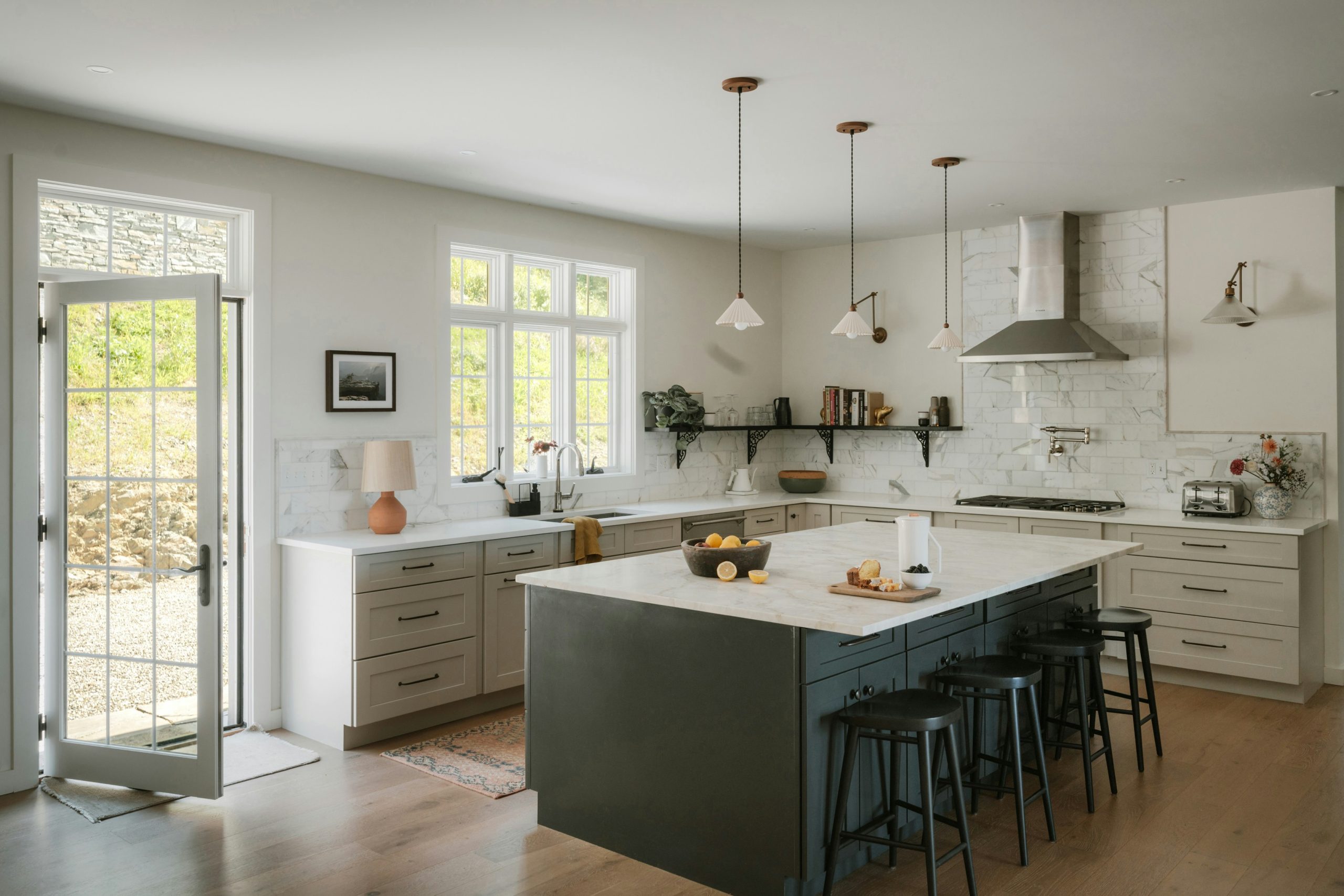
2. Bright Kitchen with a Dark Gray Island and Marble Backsplash
Style Math: This look follows a classic formula for timeless appeal: 60% light neutral + 30% dramatic anchor + 10% natural texture. The light grey shaker cabinets and white marble backsplash provide the bright, neutral base. The dark grey island is the dramatic anchor, creating a focal point and adding depth. Finally, the light wood flooring brings in the 10% of natural warmth and texture, preventing the grey and white from feeling too cold. Notice how the dark island creates a focal point, similar to the mood in Idea #5, but with a cooler gray palette.
🔧 How-To Brief
Real Talk: A full marble backsplash is stunning, but it requires commitment. Marble is porous and can stain or etch from acidic foods like lemon juice or tomato sauce if not sealed properly and wiped up quickly. For a busy family kitchen, this might be a source of stress. Also, pleated fabric pendants over a cooking area can accumulate grease and dust. They look beautiful but plan on regular, careful cleaning to keep them looking fresh.
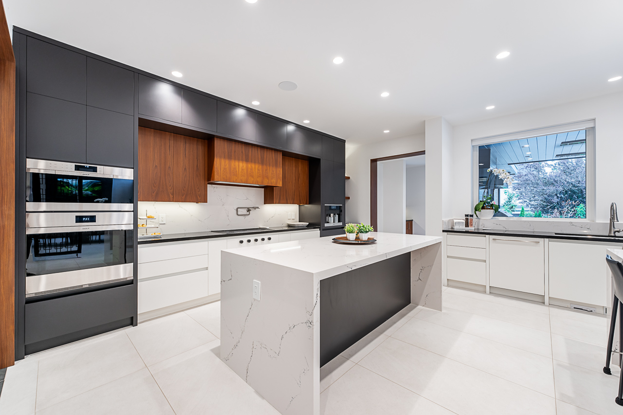
3. Sophisticated Kitchen with Mixed Black, White, and Wood Cabinetry
The One Thing: The waterfall edge on the kitchen island is the single element that elevates this design from simply ‘modern’ to ‘architectural.’ It’s a bold, continuous flow of the veined countertop material down the side of the island, creating a solid, sculptural block. Without it, the island would still be functional, but it would lose its statement-making power. It’s an investment, but it’s what makes the entire composition feel deliberate and high-end. This is a perfect example of a design that blurs the line between furniture and art.
📐 Style Math
Scale Guide: A multi-finish layout like this works best in a medium to large kitchen, ideally with at least 150 square feet. The mix of dark gray, white, and wood needs room to breathe. In a smaller space, this many finishes can feel chaotic. You need a minimum ceiling height of 9 feet to pull off the flush, integrated cabinetry and lighting without making the room feel compressed. The island itself, with its waterfall edge, demands at least 42 inches of clearance around it to be appreciated as a centerpiece.
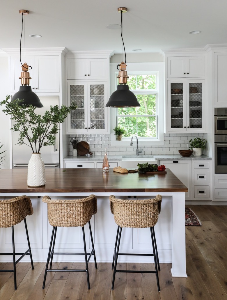
4. White Farmhouse Kitchen with a Warm Wood Island
Get This Look For Less: The modern farmhouse vibe is very achievable on a budget. Swap the custom white shaker cabinets for IKEA’s GRIMSLÖV or SEKTION series. Instead of a solid dark wood island top, which can cost thousands, opt for a butcher block countertop from a hardware store like Home Depot or Lowe’s and stain it a rich walnut or espresso finish for about $300-$500. The key is to spend on the details that have impact: find similar copper and black pendants on Wayfair or Amazon, and look for woven rattan or hyacinth stools at Target or World Market.
📏 Scale Guide
How-To Brief: Create the ‘Glass & Mesh’ Cabinet Look. Time: 2-3 hours. Cost: $50-$80.
- Carefully remove the cabinet doors you want to modify.
- Use a router or oscillating tool to cut out the inner wood panel, leaving the frame intact. Sand the inside edges smooth.
- Paint the inside frame edge to match the rest of the door.
- Cut a piece of decorative metal mesh or screen (available online or at hardware stores) about 1/2 inch larger than the opening on all sides.
- Secure the mesh to the inside of the door frame using a staple gun or small screws with washers.
- For the glass door, have a local glass cutter make a pane to size and secure it with clear silicone or glazing points.
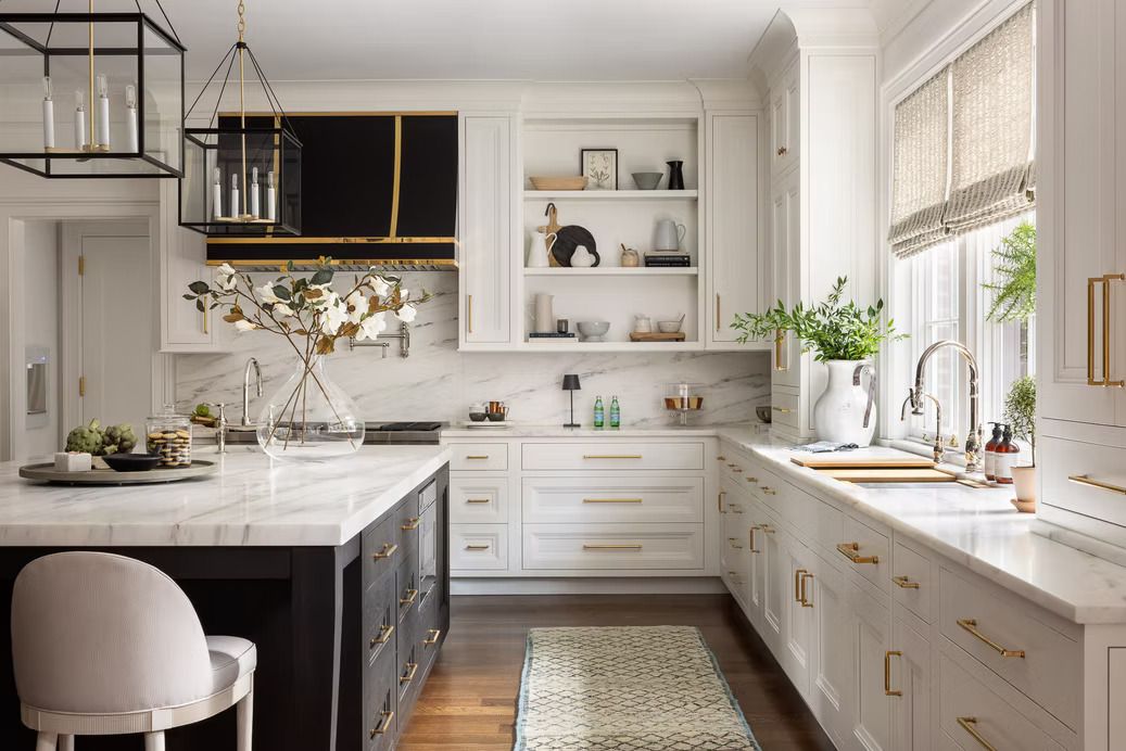
5. Elegant White Kitchen with a Dark Island and Brass Accents
Trending Context: This look hits on the ‘enduring elegance’ trend we’re seeing everywhere. People are moving away from fleeting, niche aesthetics and investing in classic combinations that won’t feel dated in five years. The white cabinets, dark island, and marble-and-brass combo is a direct descendant of grand, historic kitchens, but updated with clean lines (like the shaker cabinets) and modern lighting. It feels both current and timeless, which is why it’s a go-to for designers and a constant favorite on Pinterest. It’s a safe but incredibly chic bet.
⚠️ Real Talk
What Makes It Work: Contrast and repetition are doing all the heavy lifting here. The dramatic contrast between the brilliant white perimeter cabinets and the dark, grounding island creates immediate visual interest. The repetition of the brass finish—on the cabinet hardware, the faucet, and the pendant lights—weaves a thread of warmth throughout the entire space, tying everything together. The consistent use of white marble on both the countertops and the backsplash creates a seamless, luxurious backdrop that lets the contrast and brass accents shine.
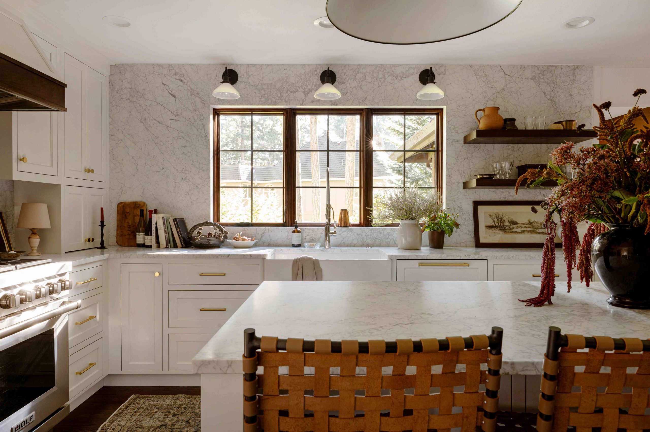
6. White Cabinet Kitchen with a Full-Height Marble Slab Backsplash
Maintenance Reality: A full-height marble backsplash is the epitome of luxury, but it doesn’t come without homework. You’ll need to have it professionally sealed upon installation and then resealed every 6-12 months, depending on use. Acidic splatters from cooking (think wine, vinegar, tomato sauce) are its enemy and must be wiped up immediately to prevent etching. For cleaning, use only a pH-neutral stone cleaner—never a generic all-purpose spray. The brass hardware will also develop a natural patina over time; if you prefer a bright finish, it will require regular polishing.
🎯 What Makes It Work
The One Thing: The dark wood window frame is the soul of this kitchen. Surrounded by a sea of creamy white and pale marble, this single element provides a crucial, organic contrast and a focal point that draws the eye. It keeps the space from feeling one-note and adds a layer of architectural depth. Swapping it for a white frame would make the room feel much flatter and less special. It’s a reminder that sometimes the smallest details have the biggest impact, framing not just the view outside, but the entire design.
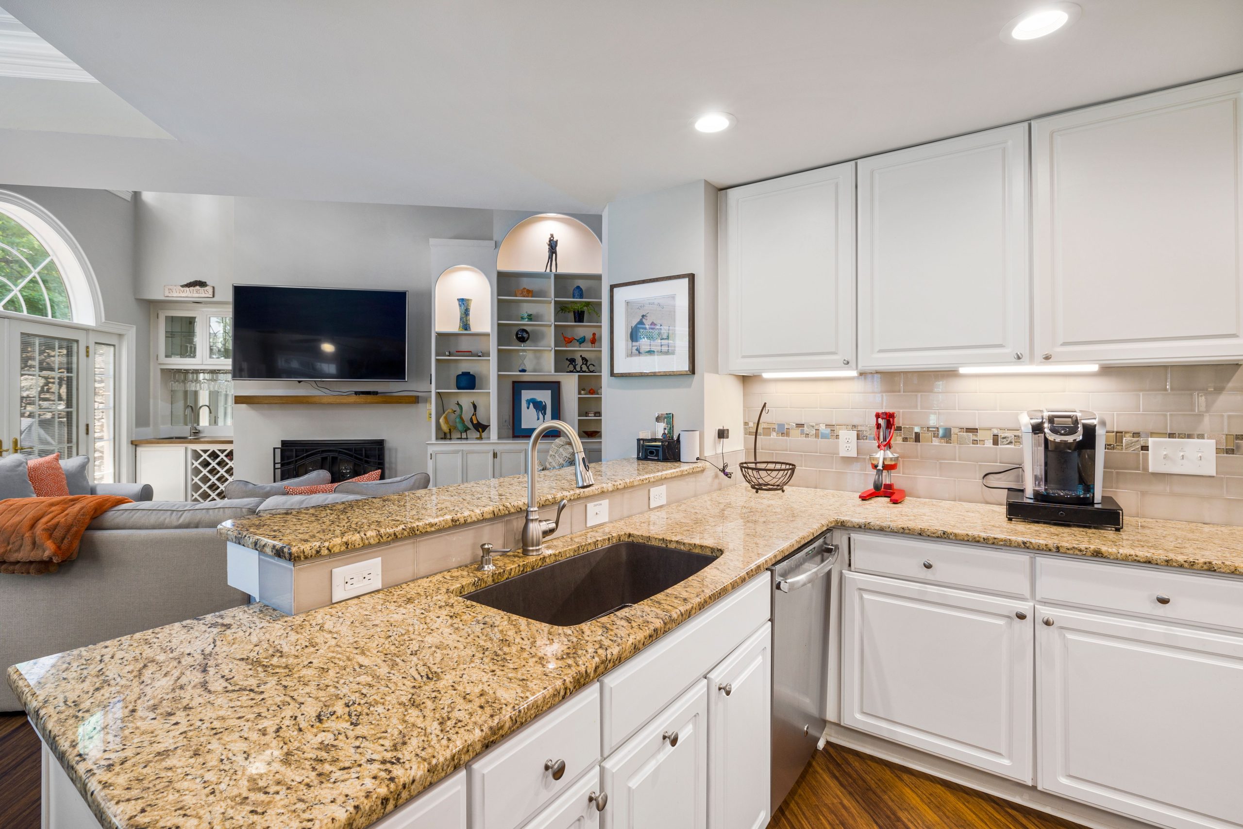
7. Open-Concept Kitchen with a Two-Tier Granite Island
Real Talk: The two-tier island was a popular solution in the early 2000s for hiding kitchen mess from the living area, but it can feel dated in 2026. The raised bar-height section breaks up the counter space, making it less useful for large prep tasks like rolling out dough or serving a buffet-style meal. It also creates a visual barrier that can make the kitchen feel more closed off than a single-level island would. While practical for some, consider if a large, flat surface might ultimately be more flexible for your lifestyle.
⭐ The One Thing
Designer Tip: If you have an open-concept space and want to create a sense of definition, use lighting and ceiling details. In this room, the subtle dropped ceiling over the kitchen area and the placement of recessed lights help define the kitchen ‘zone’ without walls. The built-in shelving with arched tops also helps to visually separate the spaces while maintaining the open feel. It’s a way to create ‘rooms within a room’ that feels intentional and integrated, a much more modern approach than the split-level island.
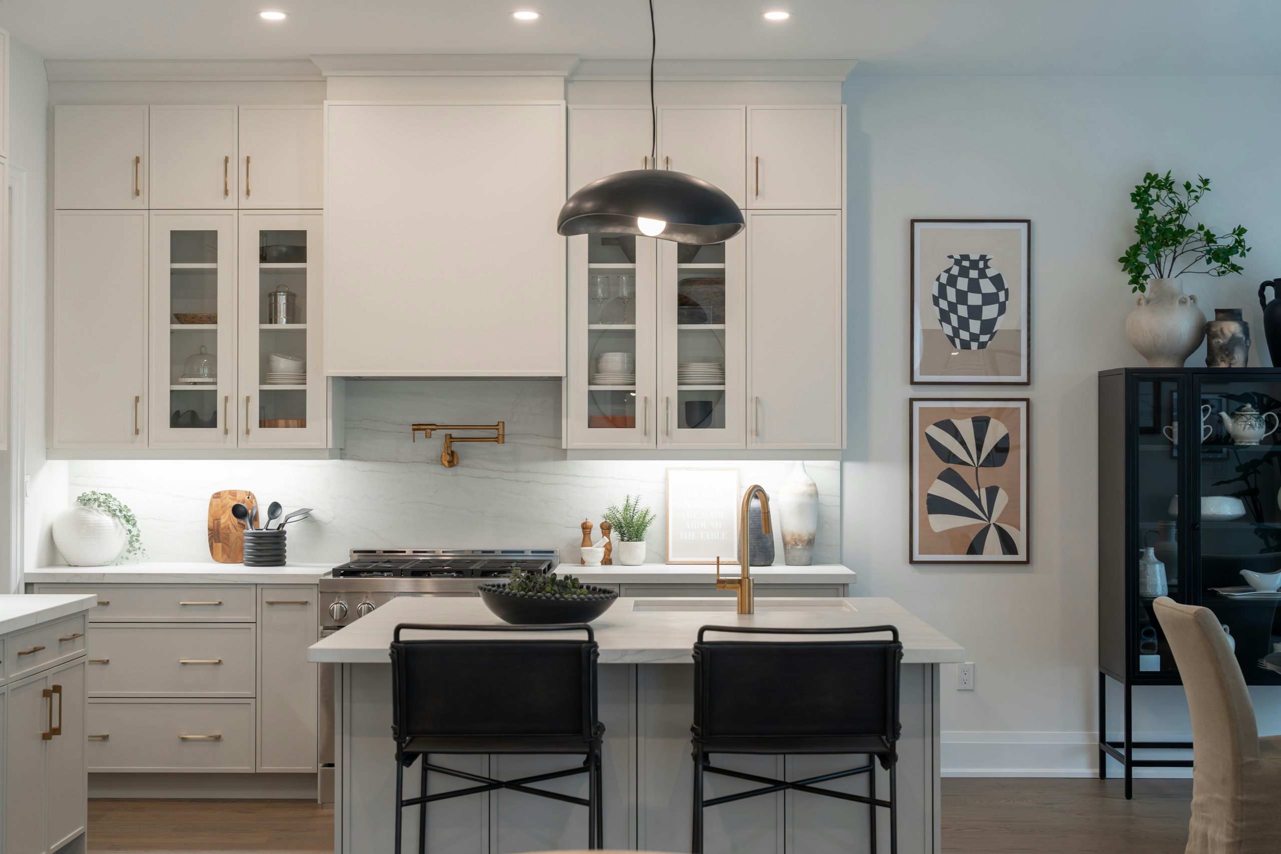
8. Neutral Modern Kitchen with Marble Backsplash and Island Seating
What Makes It Work: This design sings because of its sophisticated restraint. The magic is in the subtle blend of textures within a tight, neutral palette. You have the smooth, matte finish of the light grey cabinets, the polished gleam of the marble slab backsplash, the warm shine of the brass hardware, and the flat black of the stools and pendant light. Each material speaks quietly, and the result is a calm, layered space that feels incredibly high-end. The framed art is a perfect finishing touch, adding a personal, organic element. The full-height marble slab backsplash is the star here, a more minimalist take on the luxurious material seen in Idea #6.
💸 Get This Look For Less
Get This Look For Less: A full marble slab backsplash can be a major budget line item. To get a similar look for about 60% less, use large-format (24″x48″) porcelain tiles that mimic the look of marble. They have minimal grout lines and can give you that seamless, dramatic effect without the cost and maintenance of real stone. For the cabinets, consider Semihandmade fronts for IKEA cabinet boxes. This allows you to get that custom, flat-panel look in a specific color at a fraction of the cost of custom cabinetry.
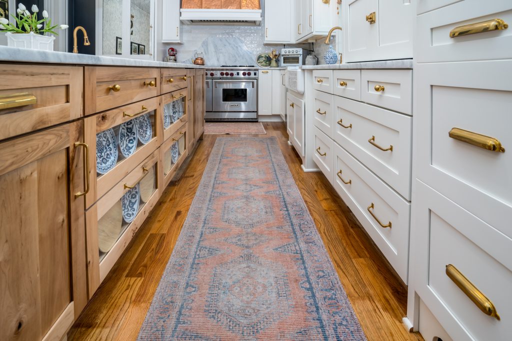
9. Galley Kitchen with Contrasting White and Natural Wood Cabinetry
Style Math: The formula here is about balance and asymmetry: 50% Crisp White + 40% Natural Wood + 10% Warm Metal. One entire wall is dedicated to white shaker cabinets, which makes the relatively narrow space feel wider and brighter. The opposite wall features natural wood, adding warmth and preventing the ‘bowling alley’ effect. The brass hardware is the 10% that ties both sides together, creating a cohesive look despite the contrasting finishes. The patterned runner rug is a clever addition, introducing color and leading the eye through the space. This is a perfect example of a modern galley. For a more traditional take on this layout, see Idea #11.
🧹 Maintenance Reality
Scale Guide: A galley layout is ideal for narrow spaces, typically between 7 and 12 feet wide. The key is to maintain at least 36 to 48 inches of clear floor space between the two runs of counters to allow for comfortable movement and for appliance doors to open fully. Any less, and it will feel cramped. Any more, and the kitchen becomes inefficient. This specific two-finish design works best in a galley that has good natural light at one end to prevent the wood side from feeling too heavy.
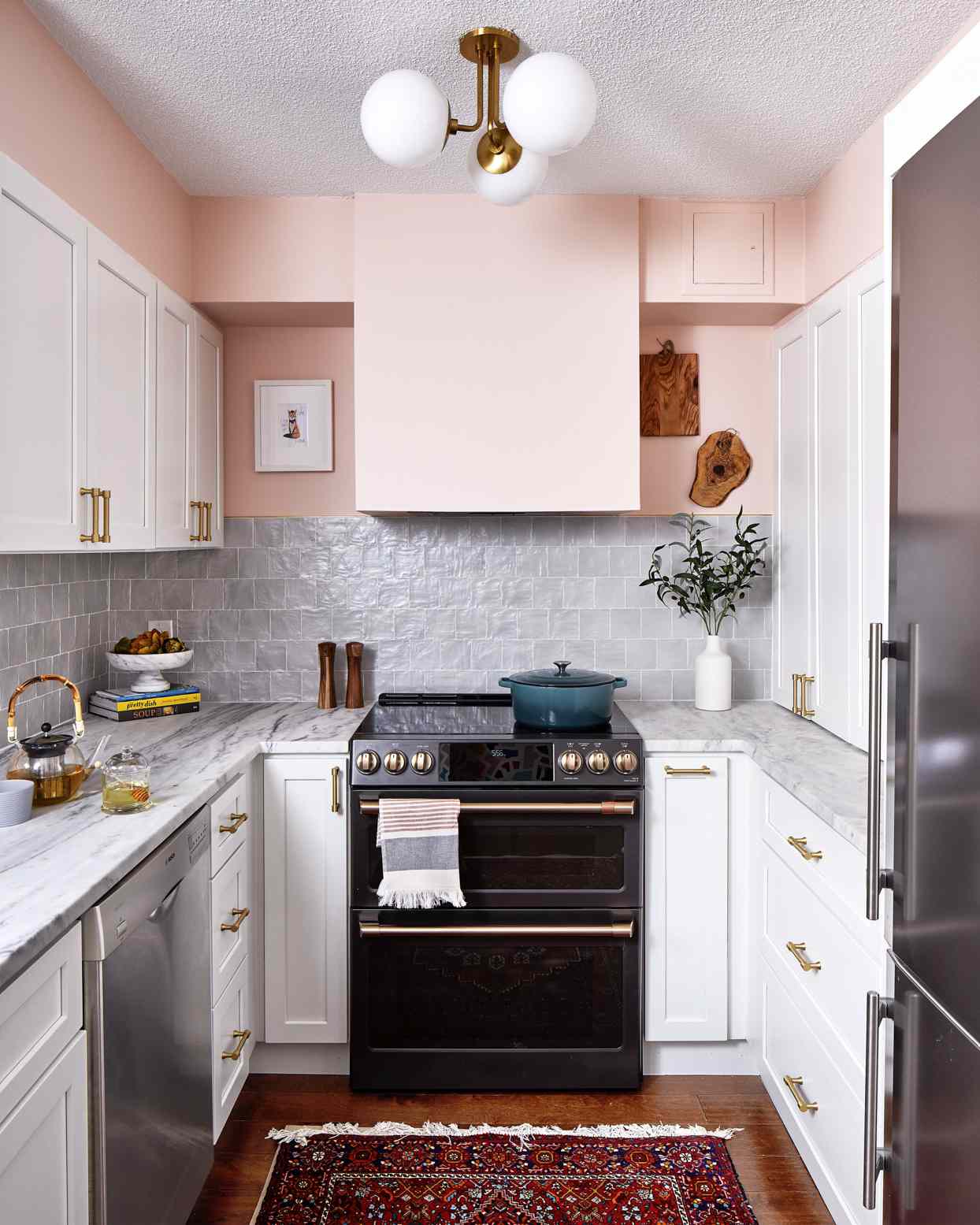
10. U-Shaped Kitchen with Soft Pink Walls and Brass Hardware
The One Thing: The custom pink range hood is undeniably the heart of this design. It’s a daring and personal choice that completely defines the kitchen’s personality. By matching the range hood to the wall color, the designer turned a functional appliance into a major design statement. It proves that you don’t have to stick with stainless steel or a cabinet-paneled hood. This single move transforms the entire space from a standard white kitchen into something unique, cheerful, and memorable. It’s confidence in color.
🔥 Trending Context
Designer Tip: When using a bold color, repetition is your friend. Notice how the light pink isn’t just on the walls—it’s carried onto the range hood, creating a cohesive and intentional look. If you’re going to use an unexpected color like this, lean into it. A single pink wall might have looked like an afterthought, but committing to the color on a major feature like the hood makes it feel deliberate and sophisticated. The white cabinets, gray tile, and white marble act as a quiet, neutral canvas that allows the pink and brass to truly pop.
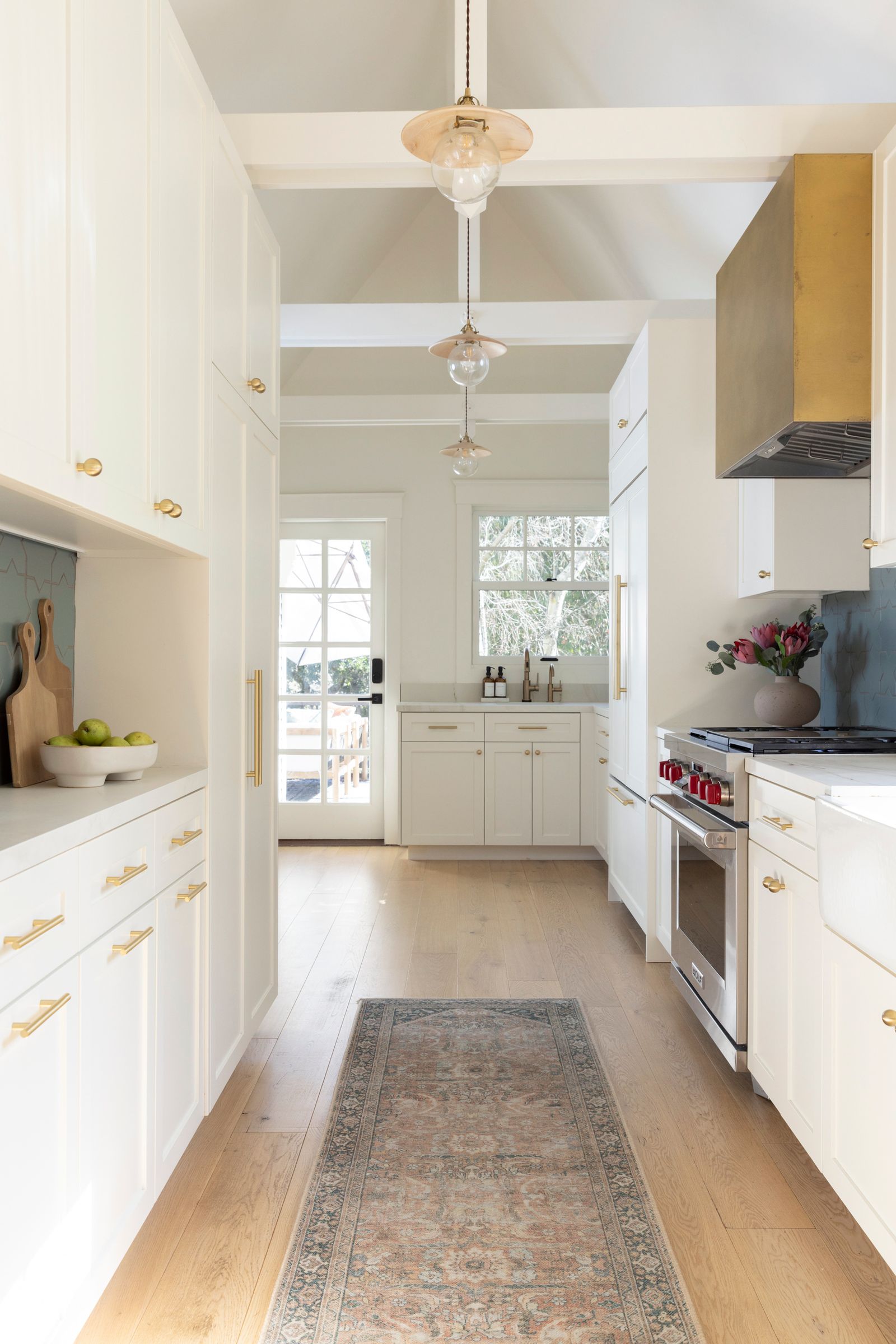
11. Airy Galley Kitchen with a Vaulted Ceiling and Warm Whites
What Makes It Work: This galley kitchen defies its narrow footprint by celebrating vertical space. The vaulted ceiling with exposed white beams draws the eye upward, creating a sense of volume and airiness that you don’t typically find in this layout. The choice of warm white for the cabinets and walls, instead of a stark, cool white, adds to the inviting, gentle atmosphere. The three glass and wood pendant lights are perfectly scaled to fill the vertical space without overwhelming it, acting as functional sculpture. This design proves that a galley kitchen can feel grand.
💡 Designer Tip
Maintenance Reality: While stunning, a vaulted ceiling in a kitchen can be a cleaning challenge. The exposed beams and high-up pendant lights will gather dust and cooking residue over time. You’ll need a good quality extendable duster or a tall ladder for periodic cleaning. The light-colored grout on the teal backsplash behind the range will also require attention; sealing the grout upon installation and using a targeted grout cleaner will prevent staining from grease splatters.
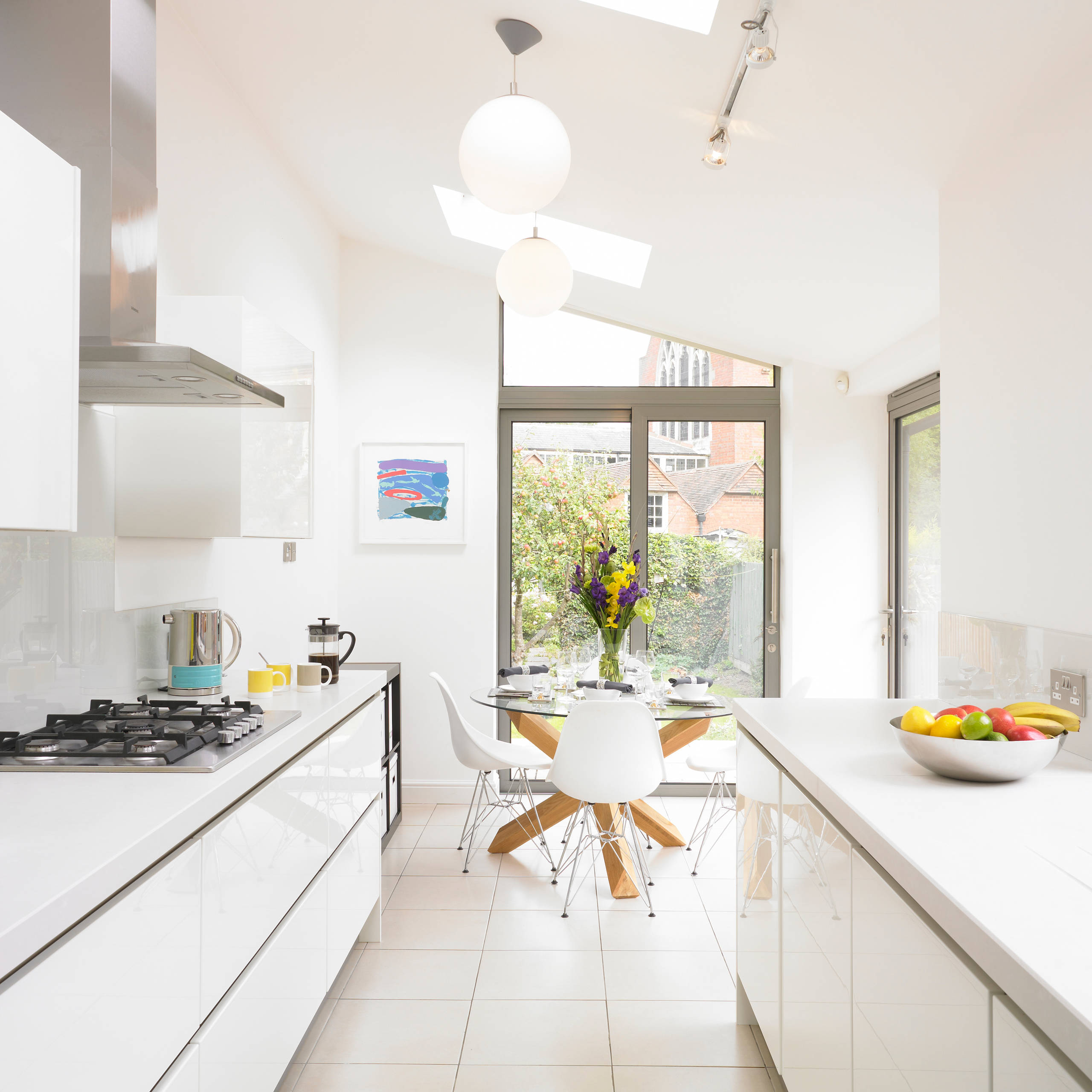
12. Minimalist Galley Kitchen with a Bright Dining Nook
Scale Guide: This layout is a brilliant solution for a long, narrow room that needs to serve multiple functions. The kitchen itself occupies a minimal footprint, with base cabinets only, which visually opens up the space. This works because there’s an entire wall of floor-to-ceiling windows. This layout requires a room at least 15 feet long but can be as narrow as 8 or 9 feet wide, as the lack of upper cabinets reduces the feeling of being closed in. The dining area at the end acts as the destination, making the whole space feel larger. While many galley layouts like Idea #9 focus on maximizing cabinet space, this one prioritizes light and airiness.
💰 Budget Breakdown
Trending Context: We’re seeing a big move towards ‘integrated living,’ and this kitchen is a perfect example. Rather than hiding the kitchen away, it’s designed to be a beautiful, minimalist feature of the main living space. The handle-less, glossy white cabinets almost disappear, reading more like modern furniture than kitchen storage. The focus is on the light, the view to the garden, and the communal dining table. This reflects a shift in how we live: the kitchen is no longer just a utility zone but a serene part of our everyday backdrop.
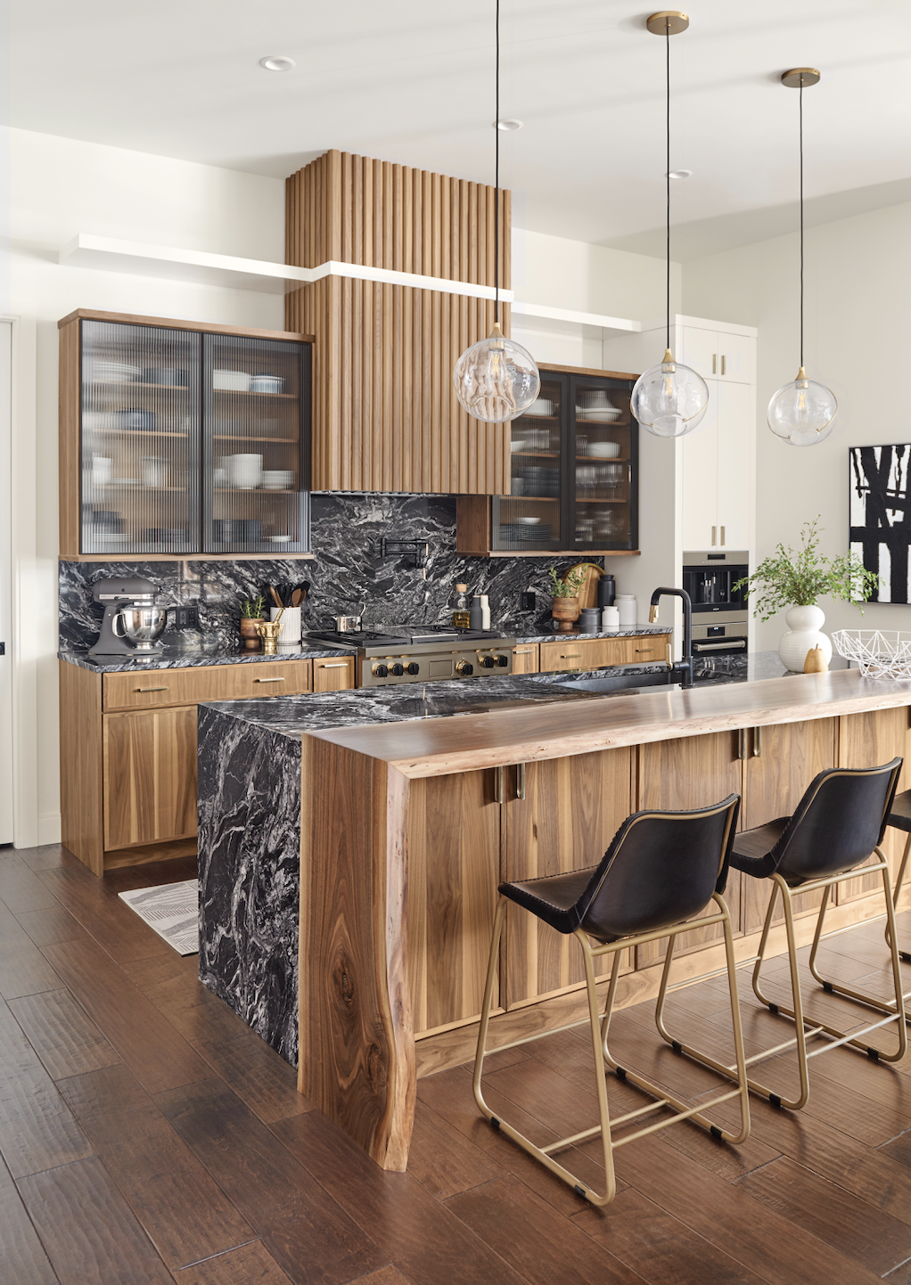
13. Modern Kitchen with Fluted Wood, Dark Marble, and Gold Accents
Budget Breakdown: Recreating this high-end, textural look is an investment in luxe materials.
- Main Furniture (Island, Cabinetry): $15,000 – $25,000
- Lighting (Pendants, integrated): $1,500 – $3,000
- Countertops & Backsplash (Marble & Wood): $8,000 – $15,000
- Decor/Accessories (Stools, etc.): $1,000 – $2,500
- Appliances: $7,000 – $12,000
- TOTAL: $32,500 – $57,500
- Budget alternative: Use wood-look laminate for the island, quartz that mimics dark marble, and gold-finish pendants from a big-box store to get a similar vibe for around $15,000 – $22,000.
✅ Before You Start
The One Thing: The fluted wood range hood cover is the element that provides the critical ‘wow’ factor. In a kitchen rich with beautiful materials, the vertical texture of the fluting adds a unique rhythmic quality and sculptural dimension. It draws the eye upward and provides a soft, organic counterpoint to the hard, dramatic marble. If it were a simple stainless steel or flat wood hood, the design would still be nice, but it would lose that crucial layer of bespoke, crafted detail that makes it feel truly special.
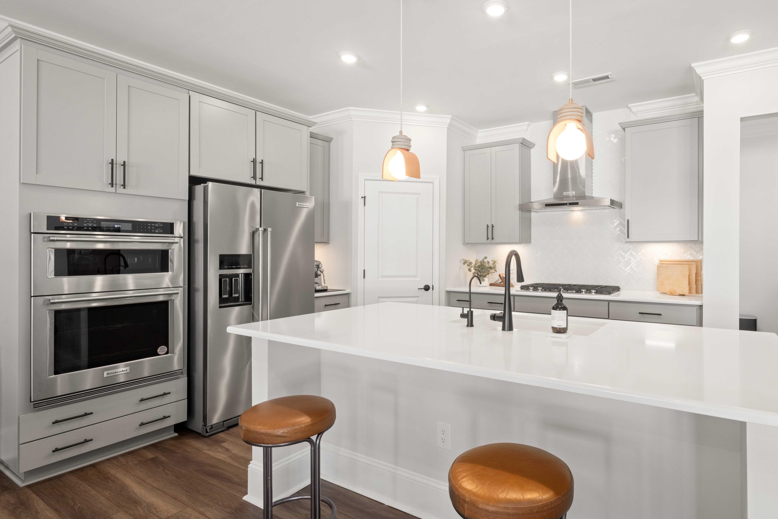
14. Light Gray Shaker Kitchen with White Herringbone Backsplash
Style Math: This kitchen’s approachable modernism comes from a simple equation: 70% Cool & Clean + 30% Warm & Rustic. The light gray shaker cabinets, white countertops, and white herringbone backsplash create a crisp, cool, and clean foundation. The remaining 30% is delivered through the warm brown leather of the bar stools, the wood tones, and the slightly rustic pendant lights. This injection of warmth is crucial—it keeps the gray and white from feeling sterile and adds a comfortable, lived-in quality. The matte black hardware acts as a grounding accent throughout.
🔧 How-To Brief
Real Talk: White herringbone tile backsplashes, especially with white grout, are classic but can be a bit of a pain to keep pristine behind a cooktop. Grease splatters are inevitable. Sealing your grout is not optional; it’s a requirement to prevent staining. Consider using a slightly darker, contrasting grout (like a light gray) which will hide minor discoloration and add a bit of graphic pop to the herringbone pattern. Also, leather bar stools require occasional conditioning to prevent cracking and keep them looking their best.
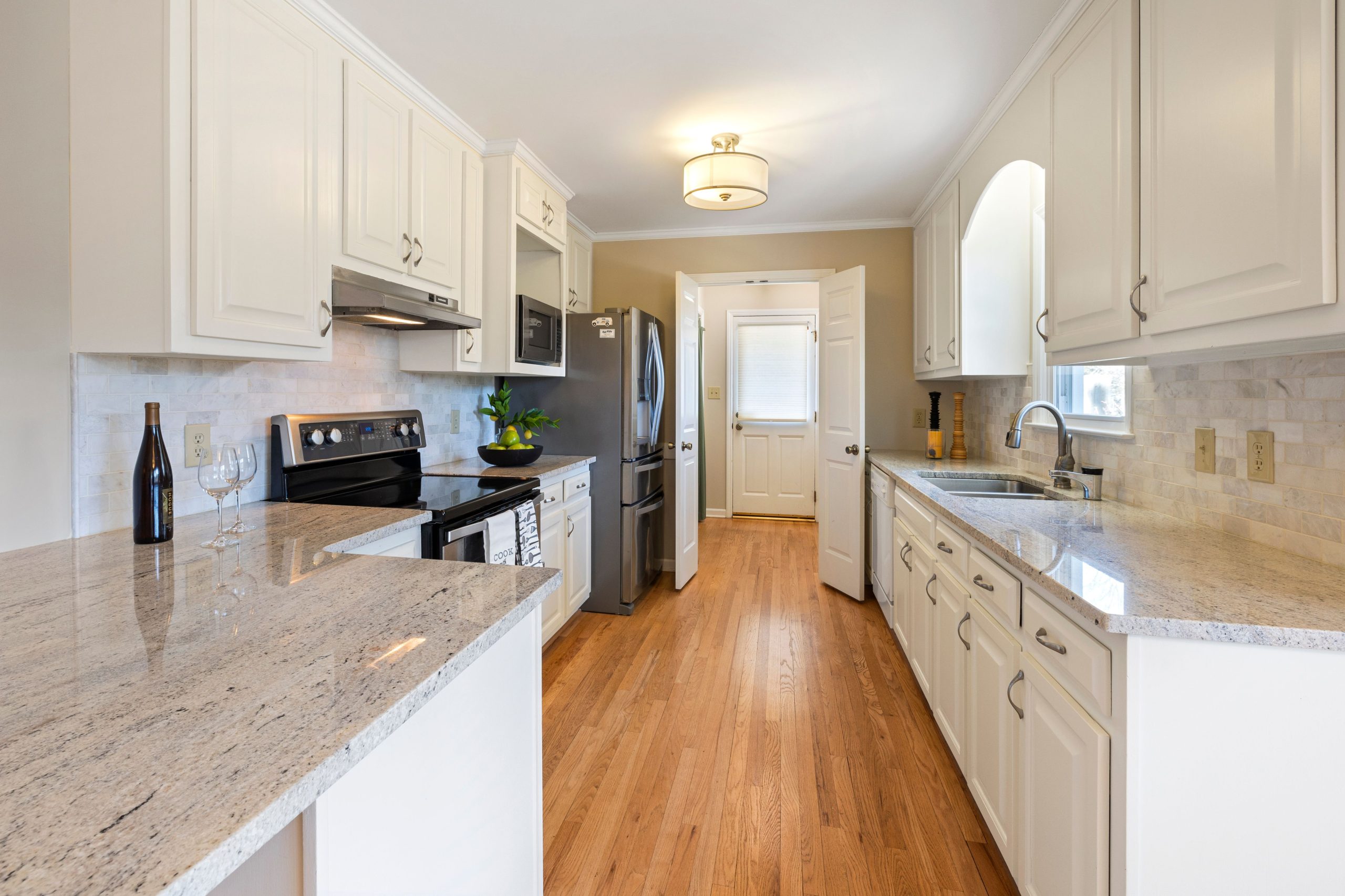
15. White Galley Kitchen with Cream Granite and Hardwood Floors
Designer Tip: In a simple, traditional galley kitchen, hardware can make all the difference. The choice of brushed nickel pulls with a gentle curve here softens the hard lines of the shaker cabinets and adds a touch of traditional elegance. For a more modern look, you could swap these for simple, straight bar pulls. For a more farmhouse feel, matte black knobs and cup pulls would work. Hardware is an easy and relatively inexpensive way to shift the entire personality of a kitchen like this without a major renovation.
📐 Style Math
Get This Look For Less: This is a very budget-friendly layout to begin with. White shaker cabinets are widely available from big-box stores like Home Depot and Lowe’s. The real savings can come from the countertop. Instead of granite, which requires fabrication and installation, look at high-quality laminate countertops. Brands like Formica and Wilsonart offer incredibly realistic granite patterns (like ‘Calacatta Marble’ or ‘Golden Romano’) for a fraction of the price, giving you this exact aesthetic for as low as $30-$50 per square foot installed.
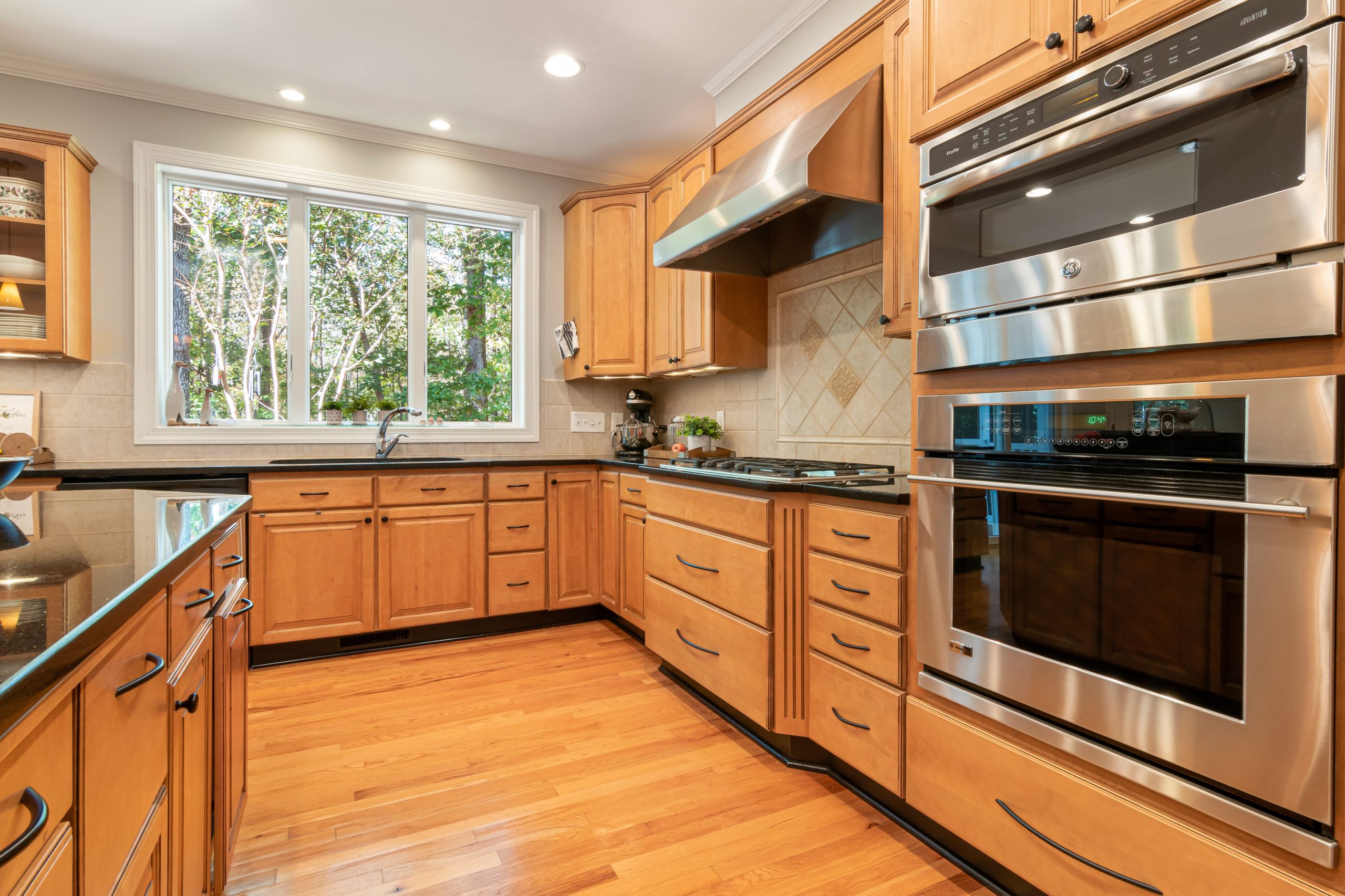
16. U-Shaped Medium Wood Kitchen with Black Granite Countertops
What Makes It Work: This kitchen is a great example of a high-contrast traditional layout. The warmth of the medium-toned wood cabinets is perfectly balanced by the deep, solid black of the granite countertops. This creates a strong horizontal line that defines the workspace. The stainless steel appliances and tan backsplash act as a neutral bridge between the two, preventing the contrast from being too jarring. The large window is also a key player, flooding the space with natural light and keeping the wood and black from feeling too dark or heavy. It’s a functional, no-fuss design that just works.
📏 Scale Guide
Scale Guide: A U-shaped layout is one of an efficient kitchen plan, creating a perfect work triangle. This layout works well in spaces that are at least 10 feet wide. This ensures you have enough room for the cabinet runs on three walls, plus a comfortable 4 to 6 feet of open floor space in the middle. If the space is too narrow, it feels claustrophobic; if it’s too wide, the journey between the opposite sides becomes inefficient. This particular design, with its medium wood tones, benefits from the large window to keep it feeling open.
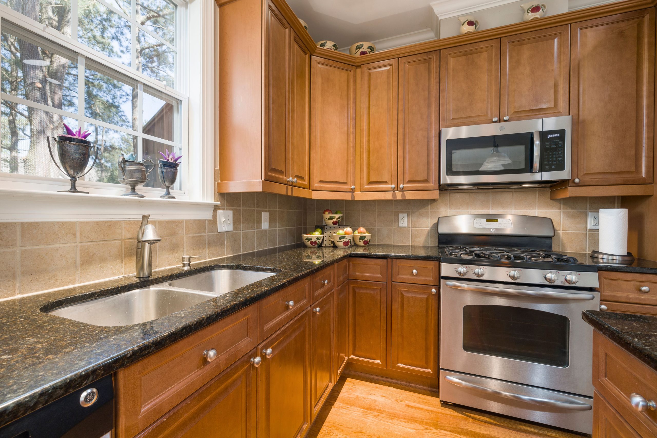
17. Traditional Light Wood Kitchen with Dark Speckled Granite
Real Talk: This combination of light-brown wood cabinets and dark speckled granite was the height of fashion in the early 2000s. While perfectly functional, it can read as dated in 2026. The speckled pattern of the granite, often called ‘Giallo Ornamental’ or similar, is a key giveaway of that era. If you have this layout and want to update it, the quickest fix is to change the countertops and backsplash. Swapping the granite for a solid white or black quartz and replacing the beige tile with a simple white subway tile would instantly bring this kitchen into the current decade.
⚠️ Real Talk
Get This Look For Less: If you’re looking for a new kitchen with a traditional feel but want to keep the budget tight, this is a good template. Opt for stock oak or maple cabinets from a home improvement store. Laminate countertops offer incredibly realistic-looking granite patterns for a significantly lower price point. By sticking to standard appliance sizes and a simple tile backsplash, you can achieve a durable, functional kitchen like this for a very reasonable cost, often under $10,000 for all materials.
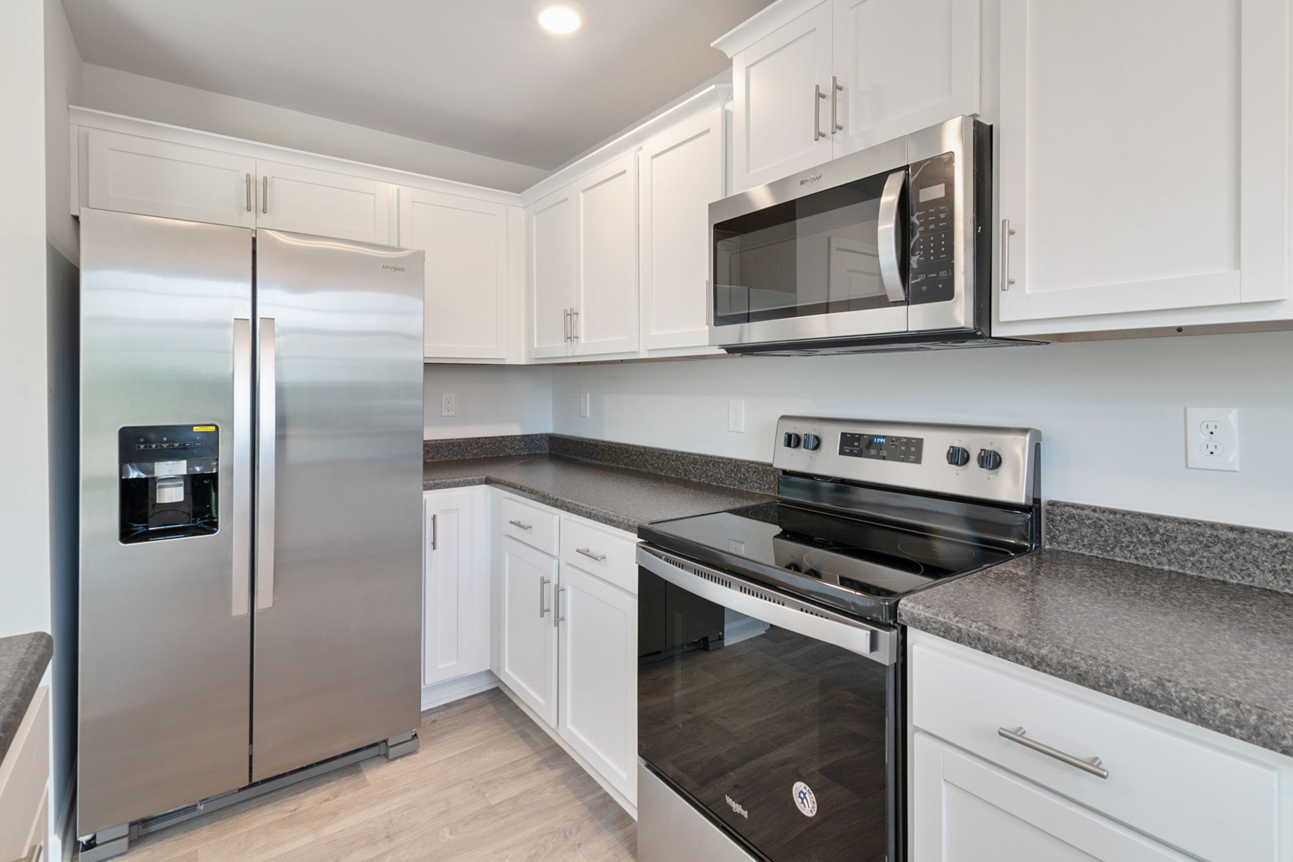
18. Clean White Kitchen with Dark Gray Laminate Countertops
Designer Tip: When working with a simple, budget-friendly palette like white and gray, the hardware is your chance to add a touch of style. The choice of simple, modern brushed nickel bar pulls here is a smart one. It gives a clean, contemporary line that elevates the basic shaker cabinets. If you wanted to warm up this look, you could easily swap these out for brass or even matte black handles. It’s a five-minute change that can completely alter the kitchen’s mood without touching the expensive items.
🎯 What Makes It Work
Maintenance Reality: Dark gray laminate countertops are a fantastic budget choice and are generally durable, but they’re not indestructible. Be vigilant with knives—always use a cutting board, as scratches on a dark, solid-color laminate can be more noticeable than on a patterned one. Also, be careful with hot pots and pans. While laminate has improved, direct contact with high heat can cause discoloration or damage. Using trivets is a must. The good news? They are incredibly easy to clean with just soap and water.
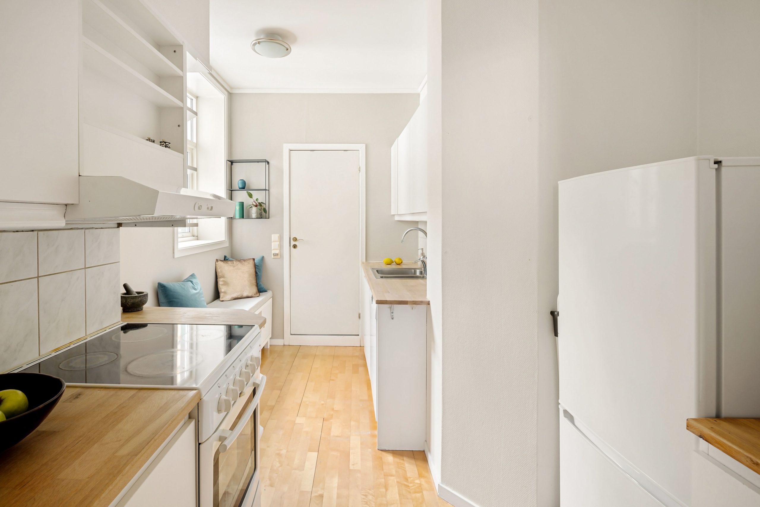
19. Compact U-Shaped Kitchen with White Cabinets and Butcher Block
Before You Start Checklist: A compact U-shape needs careful planning. Before you commit, double-check these items:
- Measure corner appliance clearance: Can your oven and dishwasher doors open fully without hitting the opposing cabinets? You need at least 36 inches of space in the center.
- Confirm your ‘work triangle’: In a small U-shape, the fridge, sink, and stove are naturally close. Ensure they are arranged logically for your workflow, not clustered in one corner.
- Window placement: Is the window centered? A window bench like this only works if it feels intentional. Ensure it won’t block access to a necessary cabinet or appliance.
- Freestanding vs. Integrated fridge: Note the freestanding fridge here. Make sure you’ve allocated enough space for it, including the ‘air gap’ clearance required around it for ventilation.
⭐ The One Thing
What Makes It Work: This tiny kitchen feels functional and charming because it uses every square inch without feeling cluttered. The U-shape provides an impressive amount of counter space for its small footprint. The window bench is a clever move, turning a potentially awkward end-run into a cozy feature. The consistent use of white for the cabinets and appliances, paired with the warm butcher block and wood floor, creates a cohesive and bright space. It’s the opposite of the grand, open space in Idea #27, proving that good design is about smart solutions, not just size.
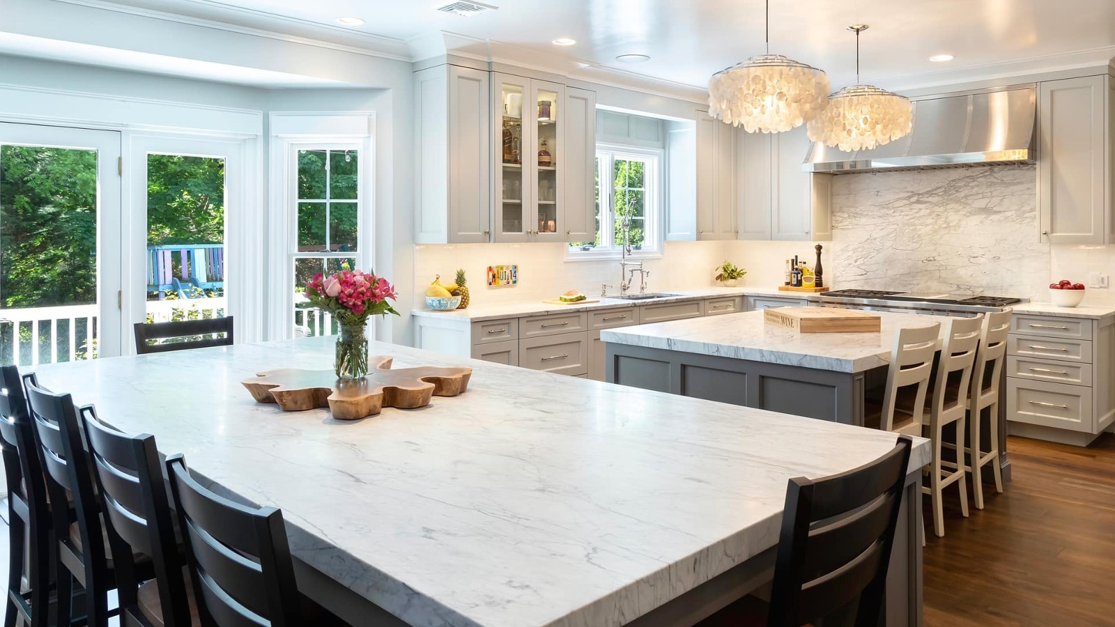
20. Exploring the Power of a Double Island Layout
The One Thing: The key advantage of a double island layout is task separation. It’s a luxury that fundamentally changes how a kitchen operates. One island can be dedicated entirely to meal prep—with a prep sink, cutting surfaces, and easy access to the refrigerator and pantry. The second island becomes the social hub and serving station, designed for seating, homework, or laying out a buffet. This separation keeps the ‘mess’ of cooking contained while allowing the ‘social’ functions of the kitchen to happen unimpeded. It’s the ultimate multi-tasking layout.
💸 Get This Look For Less
Designer Tip: For a double island layout to work, you need a substantial amount of space. Don’t even consider this layout unless your kitchen is at least 20 feet wide. You need 42-48 inches of walkway on all sides of each island. To make the two islands feel cohesive, use the same cabinetry and countertop material on both, or create a deliberate contrast—for example, one in a dark wood and the other in a light marble. Using different countertop materials can also help visually designate their different functions.
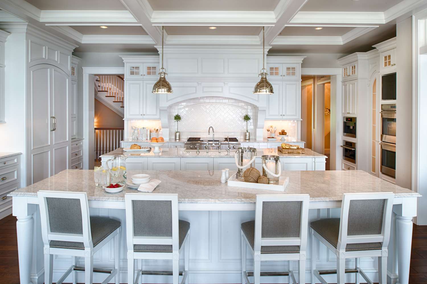
21. Gracious Kitchen Featuring Dual Light Gray Islands
Scale Guide: A dual-island design is for a generously sized kitchen, period. You’ll need a room width of at least 18-20 feet to accommodate two islands and the necessary circulation paths around them. Each walkway should be a minimum of 42 inches, with 48 inches being ideal, especially in the main work zone between the islands and the perimeter counters. The coffered ceiling here is a brilliant addition for a large room, as it adds architectural interest and prevents the ceiling from feeling like a vast, empty plane. Here, the dual island concept we explore in Idea #20 is brought to life with a sense of balance and grandeur.
🧹 Maintenance Reality
Style Math: This room’s serene and classic look is a formula of: 80% Luminous White + 15% Soft Gray + 5% Metallic Sheen. The white is the hero, used on the perimeter cabinets, ceiling, and tile, making the massive space feel bright and airy. The two islands in a soft, light gray provide a gentle, low-contrast anchor in the center of the room. The 5% metallic sheen from the dome pendant lights and hardware is just enough to add a touch of glamour without being distracting. It’s a sophisticated, low-contrast palette that spells luxury.
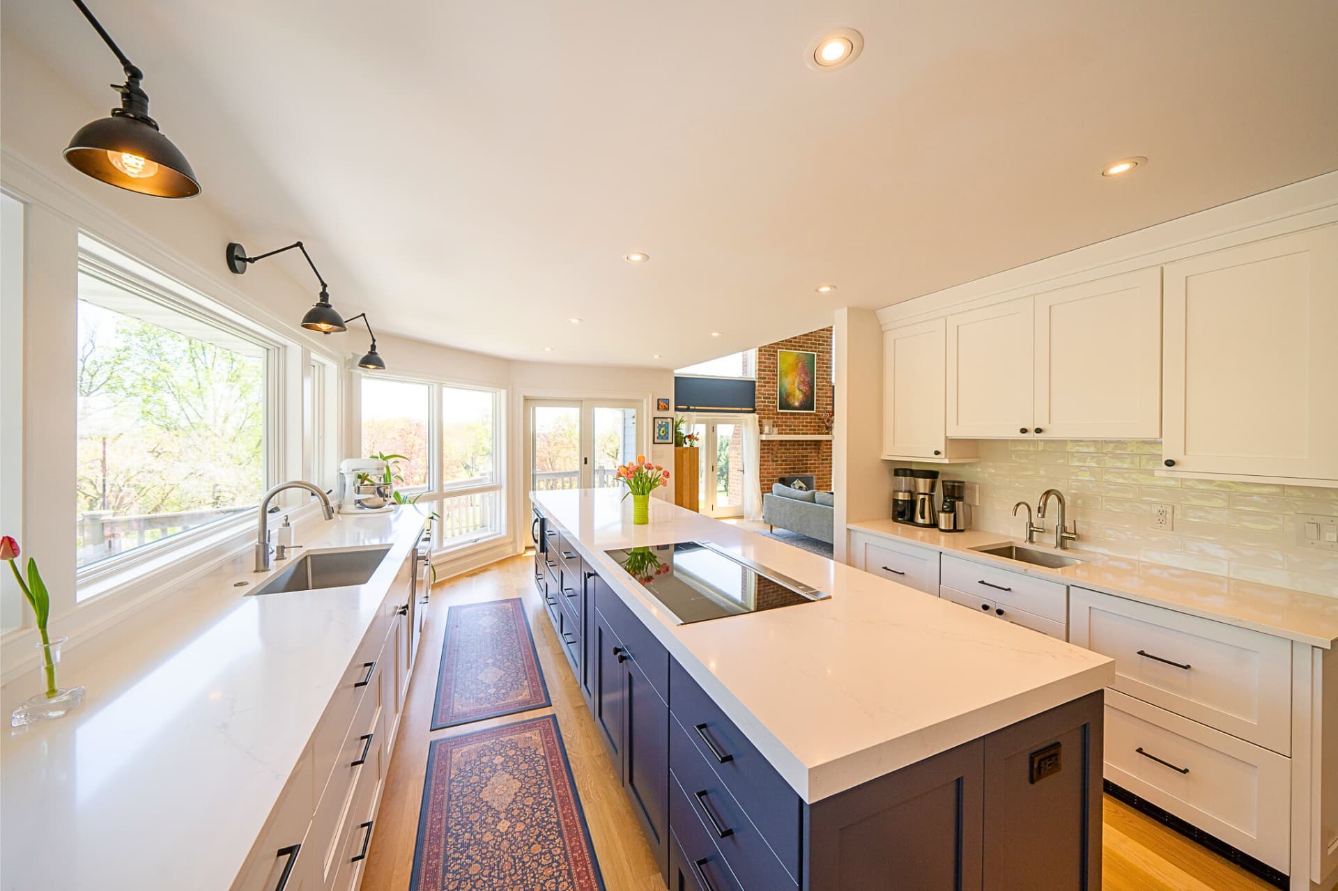
22. Designing an Effective Open-Concept Kitchen and Living Space
What Makes It Work: An open-concept layout succeeds when there’s a clear visual language connecting the different zones. In a successful design, you’ll see colors and materials from the kitchen echoed in the living area. For instance, the wood tone of the kitchen island might be picked up in the legs of the sofa or a picture frame on the wall. The metal finish of the kitchen hardware could reappear in a lamp in the living room. These subtle repetitions create a cohesive flow and make the entire space feel like one unified, intentional design rather than two separate rooms that happen to share a space.
🔥 Trending Context
Real Talk: The biggest challenge of an open-concept kitchen is noise and mess. There are no walls to hide the clutter of cooking or the sound of the dishwasher running while you’re trying to watch a movie. To make it work, you need to be committed to staying organized. Investing in a quiet-rated dishwasher is non-negotiable. You also need a powerful and quiet range hood to effectively remove cooking smells from the entire living area, not just the kitchen. An open layout is a lifestyle choice as much as it is a design choice.
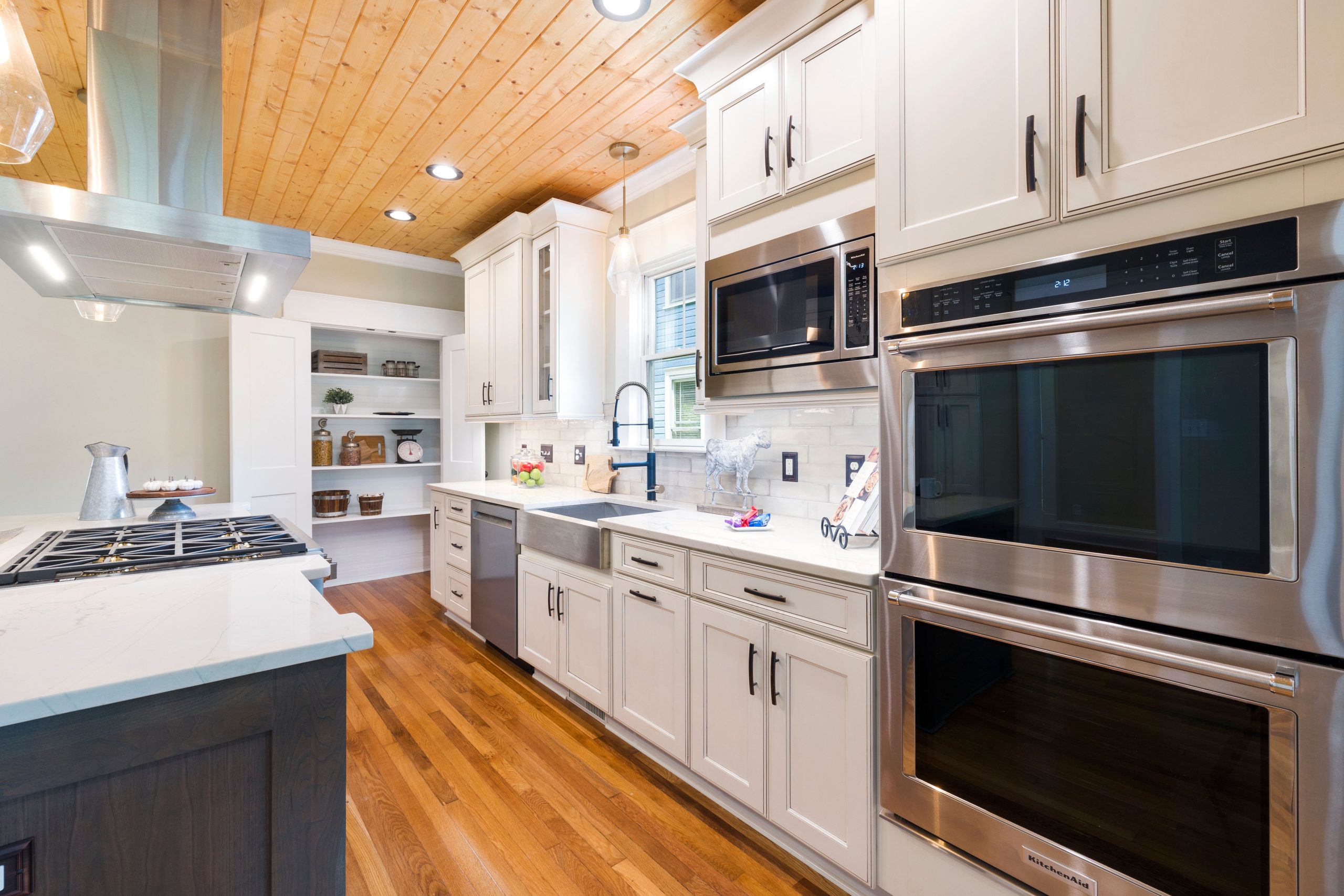
23. Integrating a Double Oven into Your Kitchen Layout
Designer Tip: The best placement for a double oven is in a tall cabinet stack, away from the primary cooktop area. This creates a dedicated ‘baking zone’ and keeps the oven doors from interfering with the main traffic flow of the work triangle. For ergonomic comfort, the bottom oven should be positioned so its rack is about hip height, and the top oven’s controls are at or just below eye level. Avoid placing it right next to the refrigerator, as the heat from the ovens can make the fridge work harder.
💡 Designer Tip
Before You Start Checklist: Before installing a double oven, confirm the electrical requirements. A double wall oven is a power-hungry appliance that typically requires its own dedicated 240-volt, 40- or 50-amp circuit. This is not a standard outlet. You will likely need an electrician to run a new, heavy-gauge wire from your home’s main electrical panel to the oven location. Factoring in the cost of this electrical work is crucial for your renovation budget.
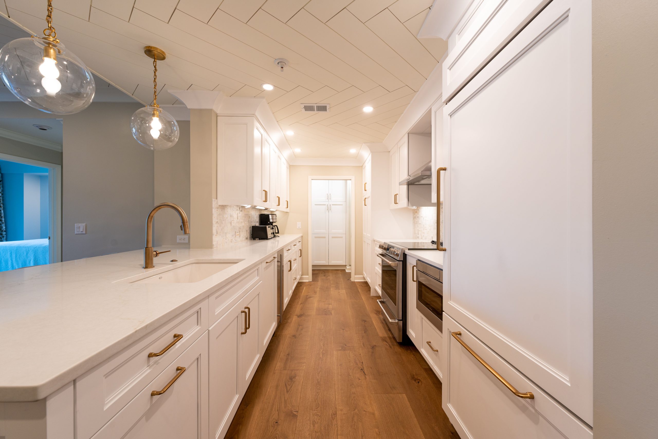
24. The Modern, Elegant Galley Kitchen with Gold Accents
What Makes It Work: Even without seeing every detail, the success of a modern white-and-gold galley kitchen hinges on proportion and light. The galley layout’s efficiency is amplified by a bright white palette, which bounces light and makes the narrow space feel wider. The strategic use of gold accents on hardware, faucets, and lighting acts as jewelry, adding warmth and a touch of luxury that prevents the white from feeling clinical. The key is restraint; too much gold can look gaudy, but just enough adds a layer of intended glamour.
💰 Budget Breakdown
Get This Look For Less: The white-and-gold look is very accessible. Use standard white shaker or flat-panel cabinets from IKEA or a big-box store. The ‘gold’ element is where you can be clever. Look for well-priced brass or gold-toned hardware and faucets on sites like Amazon, Wayfair, or Overstock. For lighting, there are countless affordable and stylish options. The trick is to ensure the ‘gold’ finish is consistent across all the pieces to create a cohesive, high-end look without the high-end price tag.
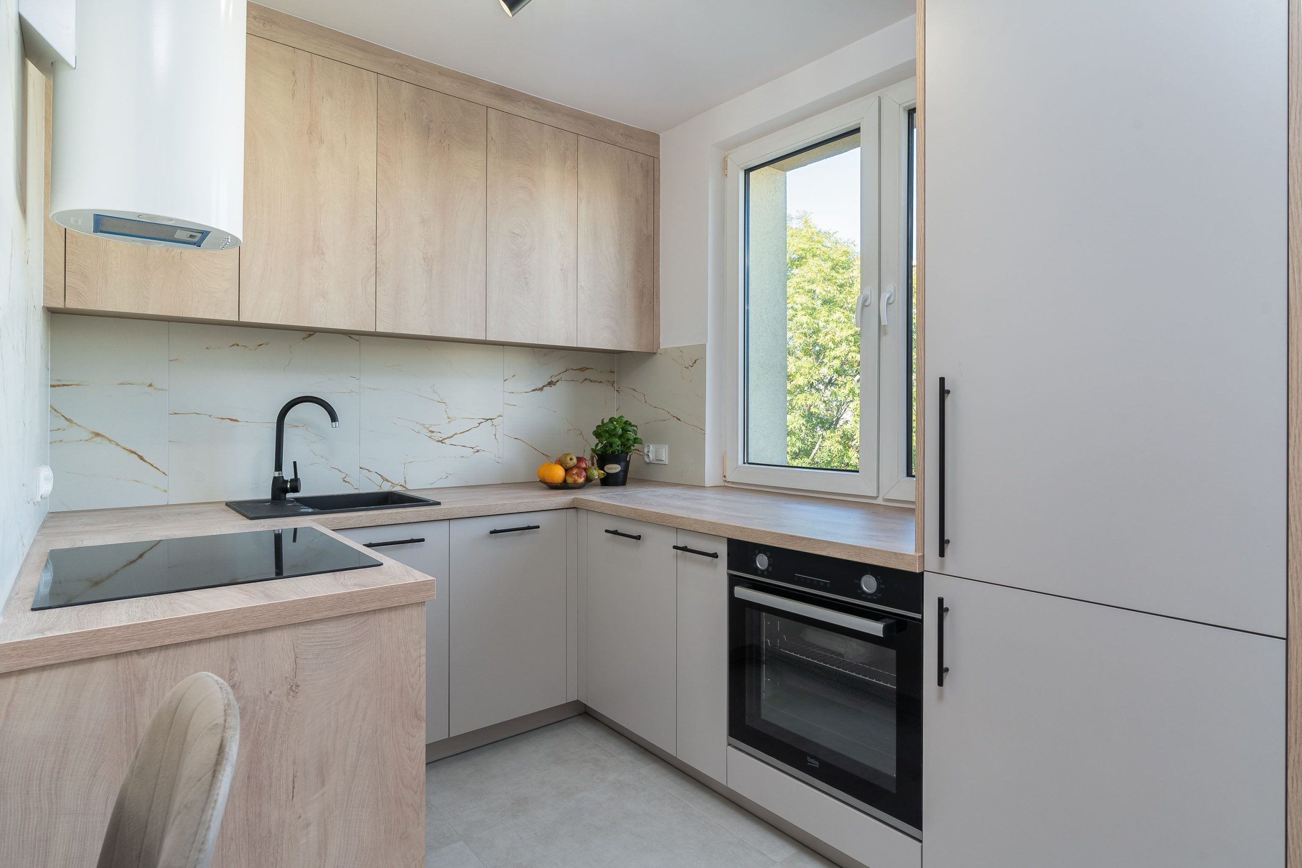
25. L-Shaped Layout with Light Wood and Pale Gray Cabinets
Style Math: This kitchen’s serene and modern character is built on a 50/50 split of texture and solid color, plus a dash of drama. 50% is the light wood grain of the upper cabinets and countertops, providing organic texture and warmth. The other 50% is the calm, solid pale gray of the lower cabinets. The dramatic accent comes from the sharp, clean lines of the black hardware, faucet, and integrated oven, which ground the light and airy palette. The gold veining in the backsplash is a final, subtle touch of warmth that ties into the wood tones.
✅ Before You Start
Designer Tip: Using two different cabinet finishes can be tricky in an L-shaped layout. A great rule of thumb is to use the lighter finish (or wood grain) for the upper cabinets and the darker or more solid color for the base cabinets. This keeps the space feeling open and airy at eye level while grounding the design. Reversing this—with dark uppers and light lowers—can make a kitchen feel top-heavy and smaller than it is. Here, the light wood uppers keep the feeling bright and spacious.
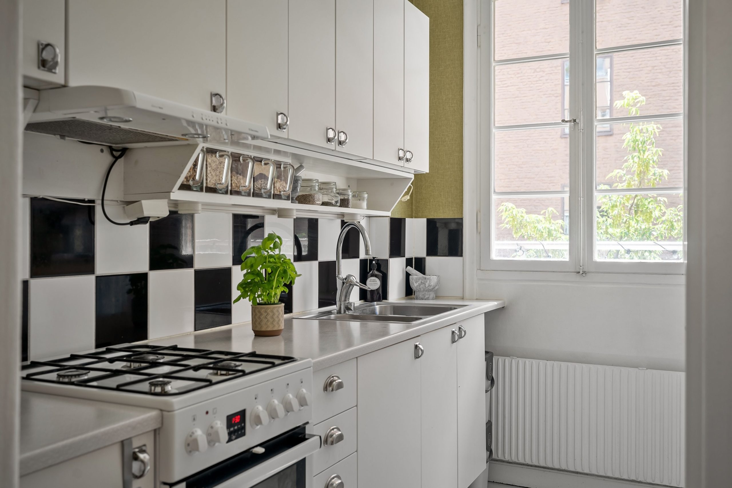
26. Classic White Kitchen with a Bold Checkered Backsplash
The One Thing: The black and white checkered backsplash is, without a doubt, the star of this show. It’s a bold, graphic choice that injects a huge dose of personality into an otherwise simple and classic white kitchen. It’s a nostalgic nod to diners and classic design, but in this context, it feels fresh and playful. Removing it would leave you with a perfectly nice, but forgettable, kitchen. This single element provides all the pattern and contrast the room needs, proving that a backsplash can be more than a functional surface—it can be art.
🔧 How-To Brief
Real Talk: A bold, high-contrast pattern like a checkerboard tile can be visually busy. It’s a strong commitment. While it looks fantastic in this clean, simple space, it might be overwhelming if you have a lot of countertop clutter or open shelving with colorful dishes. To make it work, you have to keep the surrounding elements relatively calm and neutral, as seen here with the white cabinets and simple countertops. Let the backsplash be the main event and keep the supporting actors quiet.
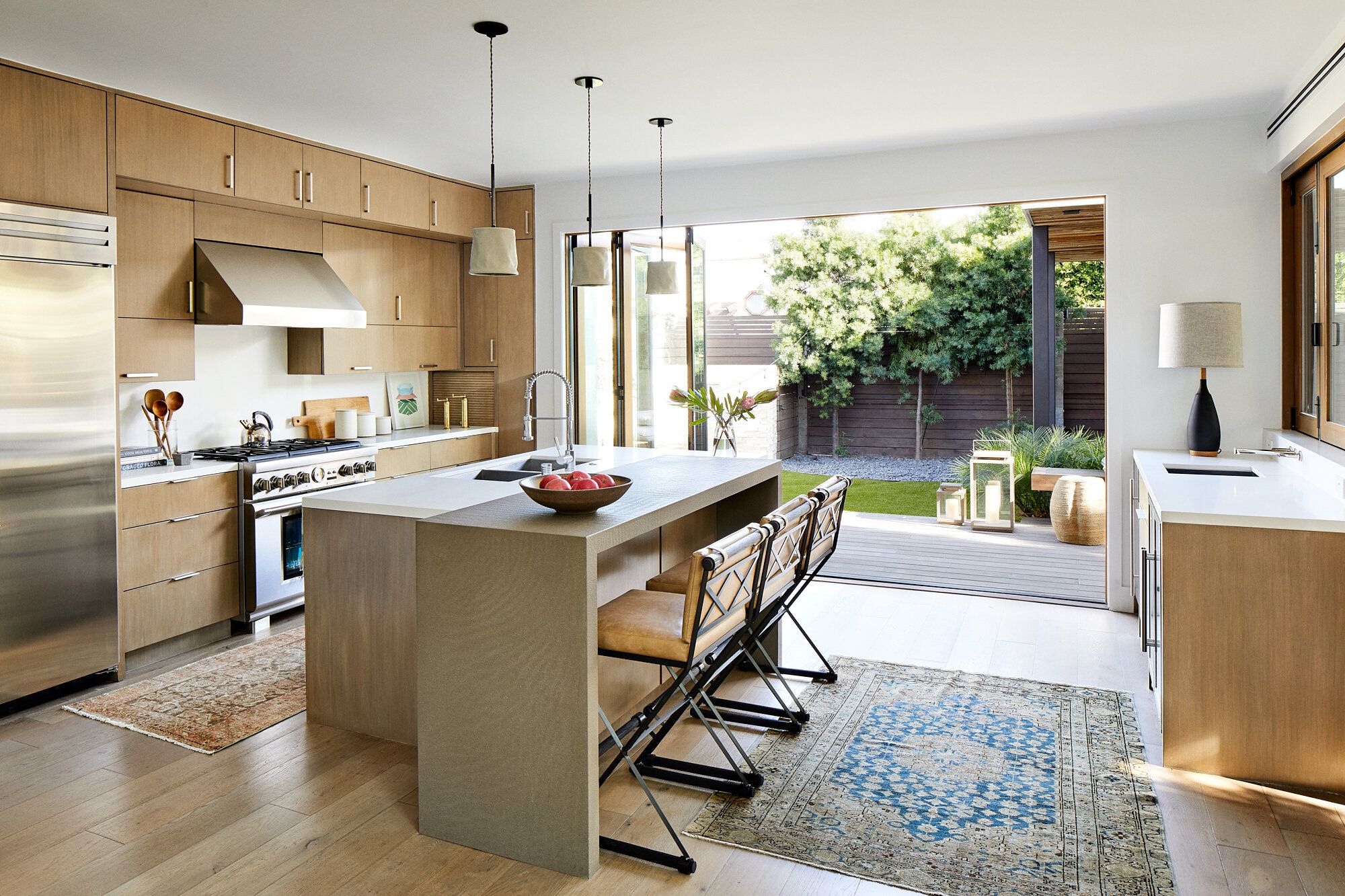
27. Warm Wood Kitchen with a Large Island and Indoor-Outdoor Flow
What Makes It Work: This kitchen feels so inviting because of its seamless connection to the outdoors and its celebration of natural materials. The use of light wood on the slab-front cabinets, flooring, and even the island creates a cohesive, warm, and organic shell. The wall of glass bi-fold doors is the masterstroke, effectively removing a barrier and making the outdoor deck feel like an extension of the kitchen. This maximizes light, air, and the feeling of space. The patterned rugs add a necessary layer of softness and color, breaking up the expanse of wood.
📐 Style Math
Trending Context: The emphasis on biophilic design—connecting our living spaces with nature—is a huge trend, and this kitchen is a perfect embodiment of it. After years of spending more time indoors, there’s a collective desire to blur the lines between inside and out. This layout, with its natural materials and direct access to a garden, isn’t just a kitchen; it’s a space designed for well-being. It prioritizes light, air, and a connection to the natural world, which is something homeowners are increasingly looking for.
28. Key Principles for a Functional Kitchen Island Layout
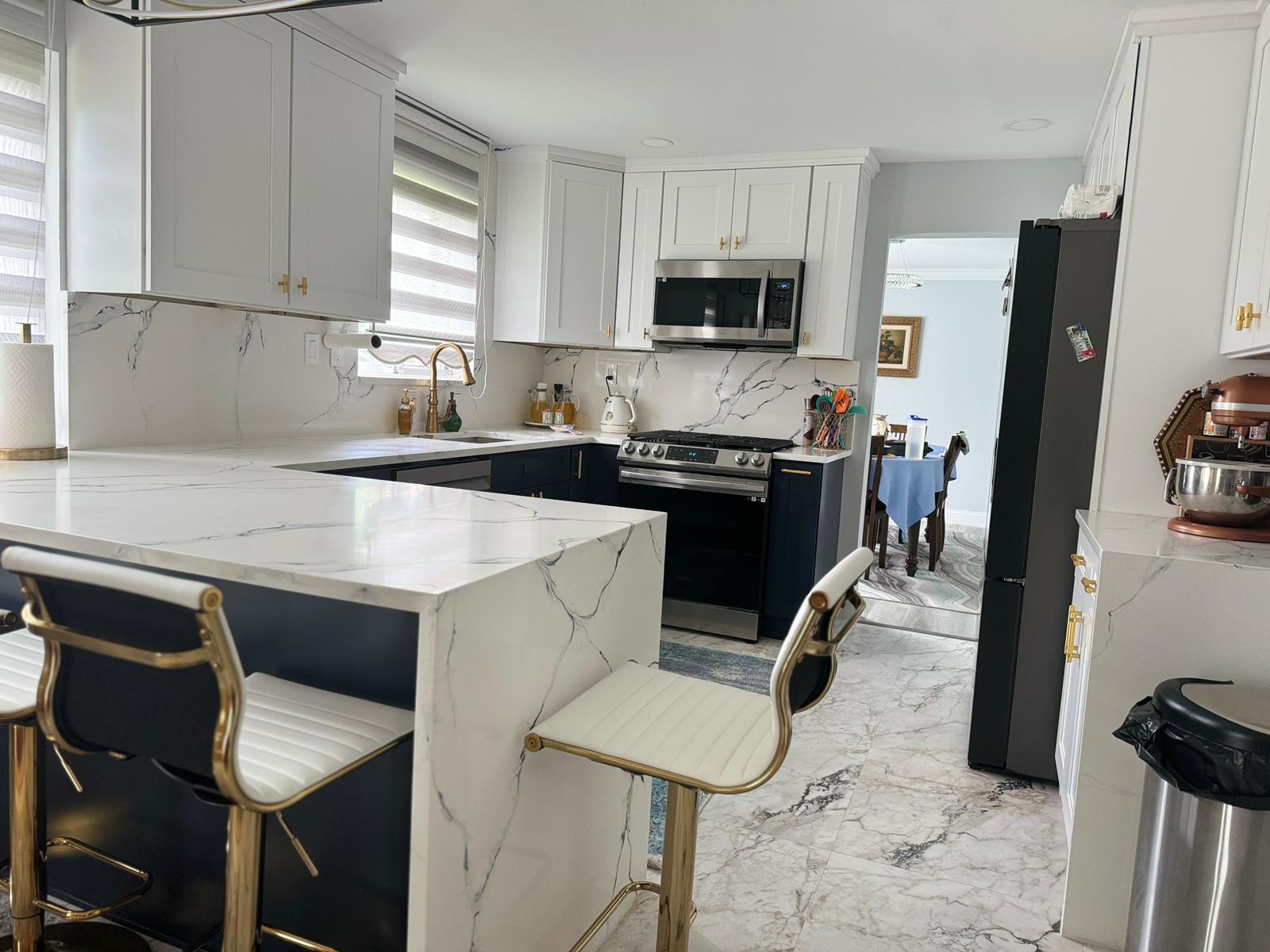
Designer Tip: An island must be more than just a box in the middle of your kitchen; its placement should enhance your workflow. The ‘work triangle’ concept still applies. If your sink is on the island, the refrigerator and cooktop should be in easy reach on the perimeter. The side of the island facing the cooktop should be clear for food prep, while the side facing the living or dining area is best for seating. Be intentional about what happens on the island—is it for prep, cooking, cleaning, or socializing? Define its primary role, and the layout will follow.
📏 Scale Guide
Before You Start Checklist: Planning an island requires precise measurements. First, ensure you have at least 36 inches, though 42-48 inches is far better, of clear walkway on all sides. Second, map out your appliance door swings. Can you open your dishwasher, oven, and refrigerator fully without being blocked by the island? Finally, consider your electrical needs. Island outlets are now required by code in most places. Plan for at least one or two outlets for small appliances, and consider if you need a dedicated circuit for an island cooktop or microwave.
Your Kitchen’s Next Chapter Starts Here
That’s a lot to take in, but remember that the perfect kitchen layout is the one that tells your story and works for your life. Don’t be afraid to mix and match ideas to create a space that’s uniquely yours. Now that you’re armed with all this inspiration, get back to that Pinterest board and start planning with confidence!